Sunday, November 16, 2008

Second Semester Work

the bath house

The bath house was designed as part of a site study which encouraged us as students, to study and delve into the characteristics of a site in Wooloomooloo. The site sat amongst terrace housing as well and being situated near a housing commission complex. Therefore, in terms of design considerations, there were many things to consider, especially the demographic and how a bath house would affect the people in Wooloomooloo.

As future architects, we were given the challenge of only using 70 square metres of internal space, leaving the rest of the space to be uncovered or exposed overhead. The other challenge was to also use the charatcteristics of the site to our advantage, hence having to excavate into the site, and embed part of the bath house within the confines of the earth.

I now want to get into the design and the ideas behind it all. In the brief handed to us by our course convenor, it was stated that there was to be no curvilinear architecture with this bath house and that the design be purely orthogonal. In my particular case, this proved to play into my hands as I felt that orthogonal architecture would allow to me create something very minimalistic and pure. I am a big fan of minimalism and purism and find that clean white edges and lines are something profoundly beautiful. The overall effect of something minimalist for this particular building would be much more aesthetically pleasing than an over complex curvilinear structure.

The entrance is open, hence reflecting the demographic of the area (housing commission etc.), I wanted to openness to reflect a sense of close knit community, hence there was to be no fee paid to enter the building or to bathe, and that like a beach, it should be open to the public at all hours. The threat of vandalism is rife however, but the facilities are for everyone to enjoy. The entry is characterised by a long double high corridor in which three horizontal voids have been cut into these walls.

This is to encourags light to beam into these corridors by day, not only above (because it is exposed) but through the voids. The voids also allow for light to be transmitted through them at night, thus introducing the theme of luminosity. To me, there is nothing more beautiful than seeing a minimalist building being luminated with a brilliant bright light. As an onlooker/observer to see something similar to the image below in a real environment would be an amazing experience.

The double high corridors also attempt at creating an 'experience' for the users of the bathouse. On the right hand side of the corridor are the changerooms, whereby the visitors are encouraged to prepare themselves for their bathing experience, within private cubicles. From there, the visitors are enticed into walking through the long corridor up a short flight of stairs which leads into a split "Y" corridor which leads the the seperate baths. The "Y" corridor sits withing the excavated part of the site. Upon turning the corner of the corridor, the visitor is faced with one of the two baths depending upon which side of the corridor they have chosen to travel.

The baths are situated right next to eachother, and are separated by a platform upon which the visitors can perch themselves atop if they feel the need to "take a break" from their bathing experience, or even converse with other visitors. Opposite the baths, ate the showers in which visitors are to further prepare themselves before bathing. I wanted to situate the showers closer to the baths as opposed to in the changerooms because I wanted to limit the hassle for the visitors of the bath house, and wanted to avoid them walking through the exposed corridors when they were wet!

Overall, the roofing (in the shape of a tophat) was used to match the theme of luminosity and minimalistic qualities of the building. Below are some of the Photos taken of the model made from balsa. The site has also been modelled in balsa.


Monday, June 16, 2008

The Environment as a Whole - Final Images

These are the images which showcase the environment as a whole, Notice how there are no striking textures for the supports? - There is a reason why, and I'll Explain it below.


I found that adding colour to the structrual supports which allow the 3 spaces to interconnect would take focus away from the actual spaces themselves. Therefore I left them a dull concrete colour, so that theyre role was determine, as supports, no more, no less. Thus the full attention is placed upon the Three Spaces themselves.

The Elevators - Final Images

The Versace elevator was all about 'class'. However this doesnt mean that I was to go over the top with the design, for Versace, it was about simplicity and I believe the elevator suited to Versaces needs quite well, as well as looked very good with the custom hand drawn tecture applied to it!
The Jobs Elevator was very literal, as you can easily tell, it the Apple Logo. Again this caters for Jobs needs similarly to how Versaces needs are covered in her elevator. The "iElevator" makes Jobs feel at home, and comfortable, as he certainly is no stranger to the logo!


The Versace Space - Final Images

The adjustments to the Versace Space include a series of steps in which onlookers in the Versace space can sit on. The concept surrounds the 'runway' which runs down the elongated axis of the Versace Office, which is somewhat like a 'catwalk'. This is so versace can feel right at home in her office, as she is such a prominent figure in the fashion industry.


The uniquness of the Versace Space is reflective upon Donatella Versace's growth as a figure in the fashion industry both before and after the death of the late Gianni Versace. The Lower area only consists of one elongated pentagonal axis which runs all the way through the space, symbolising Donatella Versace's limited power when her brother was alive. Since his death, she has taken over the reigns of the Verscace empire as showcased by the dual pentagonal combination of spaces in the upper part of the space. Thus symbolic of her increase in power.

The Meeting Space + Dining Table - Final


The concept surrounding the dining table, is rather simple. The 'claw' concept which overshadows the whole table is symbolic. It is symbolic because both clients to some extent have been overshadowed in some way or other over the course of their careers. For Jobs, he has forever been in the shadow of Bill Gates, and although is successful and powerful in his own right, still isnt as well recognised as Bill Gates, head of Microsoft. In Donatella Versace's case, she has lived in the shadows of her brother, the late Gianni Versace, and has really only gained power over the Versace empire since Gianni died.

I had decided to limit the lighting in the meeting space which reflected the concept of "overshadowed".

In terms of the textures used, I had decided to use a texture that reflected Jobs to more of an extent, as the texture symbolised a 'bit' of a computer, however the textures both on the top and bottom reflect more of a feminine touch, thus catering to Versace's needs.

Jobs Space- The Final Images

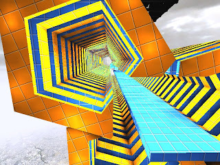
The Textures used for the final stretch of the Jobs space symbolise an age where computers and technology has grown immensely, hence the extravagence of the textures. The textures were a bit literal with the word of power, as it seems as if a jolt of electricity is running through the environment, however, they make the environment look spectacular, and show off a 'no limits' approach, mirroring Apple's expansion to not only computers, but now phones and mp3 players


The Exterior of the Jobs space centres around the themes of Grandeur and Elegance. The shiny and somewhat refelctive textures which have been used on the exterior mirrora creative and groundbreaking aura which the Apple Corperation has.
This is the begininng of Jobs' 'Long Road to Glory' which showcases the trials and tribulations of a man who has almost single handedly made Apple famous. The walk through the Jobs space is supposed to give the client himself a reminder of the Long Road to greatness in which he has travelled.

The fact that this particular image shows the walls 'closing in' on the client perhaps allows them to reminisce about times where things were not going so smoothly for them. In Job's case, it may reflect the pressure exerted on Apple by the leading worldwide computer company Microsoft.


Sunday, June 15, 2008

The 36 Textures

Rotational: Linear
Scalar; Unique
Transitional; Fading

Friday, June 13, 2008

Meeting Space - UT Textures Applied - Excluding Dining Table


These particular screenshots encapsulate both the Versace and Jobs Space in one package. The application of the green and black texture, mirrors more of the computer generation theme, of which Jobs is extremely prominent, in saying that, the texture seems to represent the inside of a computer, which relates well to the theme that is being applied to jobs. I still applied a similar texture to represent Versace, although the colour scheme reflected a must more feminine and fashinable theme. I thought the Magenta and White seemed to compliment eachother well in the whole makeup of the texture, thats what fashion is all about, complimenting colours and styles to suit diffrent taste, something a fashionista like Donatella Versace would easily understand.